Finding a website you like is a bit like dating.
Seriously? Well, give me a second here to explain.
Perusing the internet for specific websites can mirror the dating game because generally site users looks for two things: good looks and some substance! A site can be absolutely swoon-worthy, but if the user doesn't find the information (s)he is looking for, it's tough to stay engaged.
Right now, what we see on the internet is a general conflict between SEO-frantic site developers and passionate, creative designers. Some websites which have been search engine optimized are left text-heavy, and quite frankly - bland looking. Others, created by talented purely design-driven artists lack site usability and functionality. The newest challenge for websites is to integrate a fusion of both elements. A site must have a visually appealing design interface and still manage to maintain strategic site usability.
If done correctly, a website should act as a measurable business tool as well as an interactive, dynamic advertisement which reinforces the brand, personality, and values. Ultimately, the goal is to create an engaging experience for each visitor and potential customer that visits a site.
Measure
First, we'll look at a website as a measurable business tool.
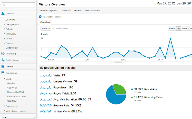
Through a website, a company has the potential to drive and funnel site users to specific destinations, information, and call-to-actions which can be vastly important for website ROI and its ability to be measured. There are numerous tools on the internet that can help you track, measure and analyze the way your visitors are interacting with your website.
Google Analytics is probably the most popular: it is both insightful and free, but there are plenty of other options With these tools, you can see what path they take through your website and how they land on specific information. Additionally, you can see where the traffic drops off, where the traffic spends the most time, and even the general demographic of your traffic.
A company can even link their social media pages to the analytical tools to see what information and updates the users find interesting. This is extremely valuable data that can be used to guide future business offers, new products, and new services. Some measuring tools, such as Google Analytics, allow a user to set up goals and track conversion rates. Again, this helps to track a website ROI.
Design
- Top left of page should tell the user what the company is, what they do, and what the user will find throughout the website.
- Keep text blocks short and concise, especially on the homepage. Add links such as "read more". Like a newspaper, if a headline catches the reader's view, he or she will take the time to read a specific article or page that is of special interest.
- Have a clear primary navigation menu at top of page or on the left vertical side. A user should never land on a homepage and not know where to go from there. Create a clear path for them to continue throughout the pages of your site.
- Provide the most important information on the top half of the page. The visitor should not have to engage with the scroll bar to access the most important information or links.
- Keep in mind that site users direct their vision to the left corner, and work their way down and over towards the middle of the page.


